


Mango Languages
Logo / Branding
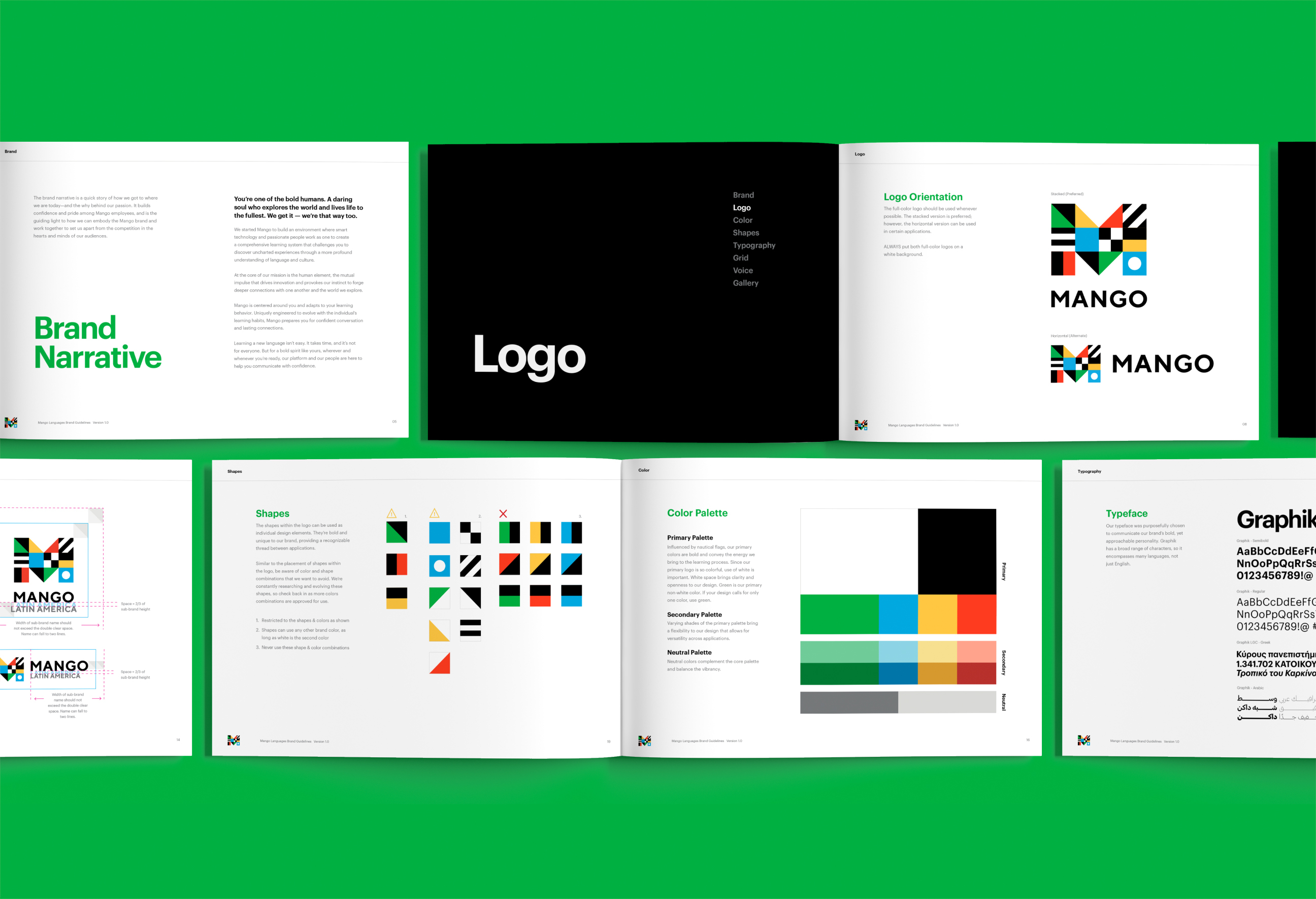
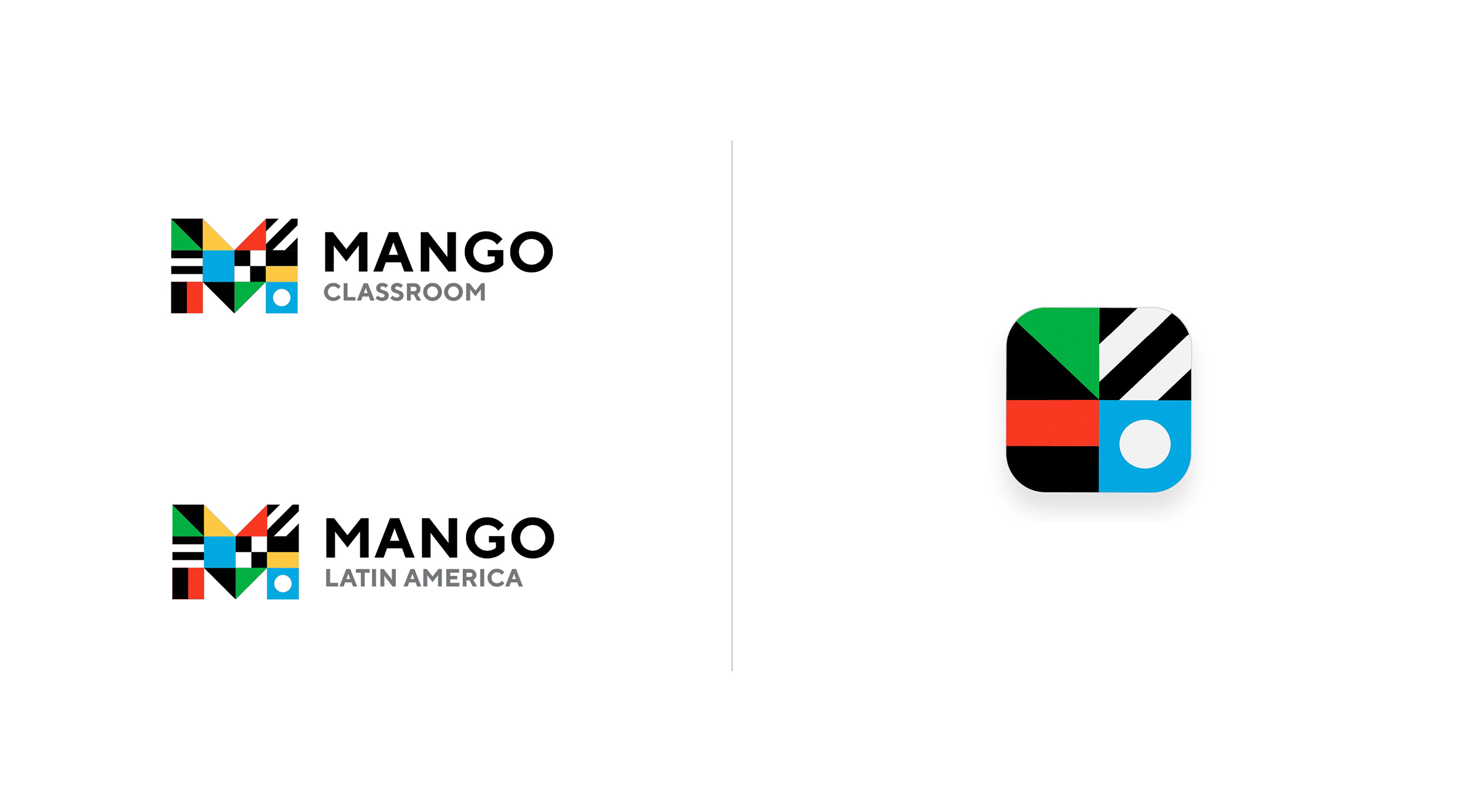
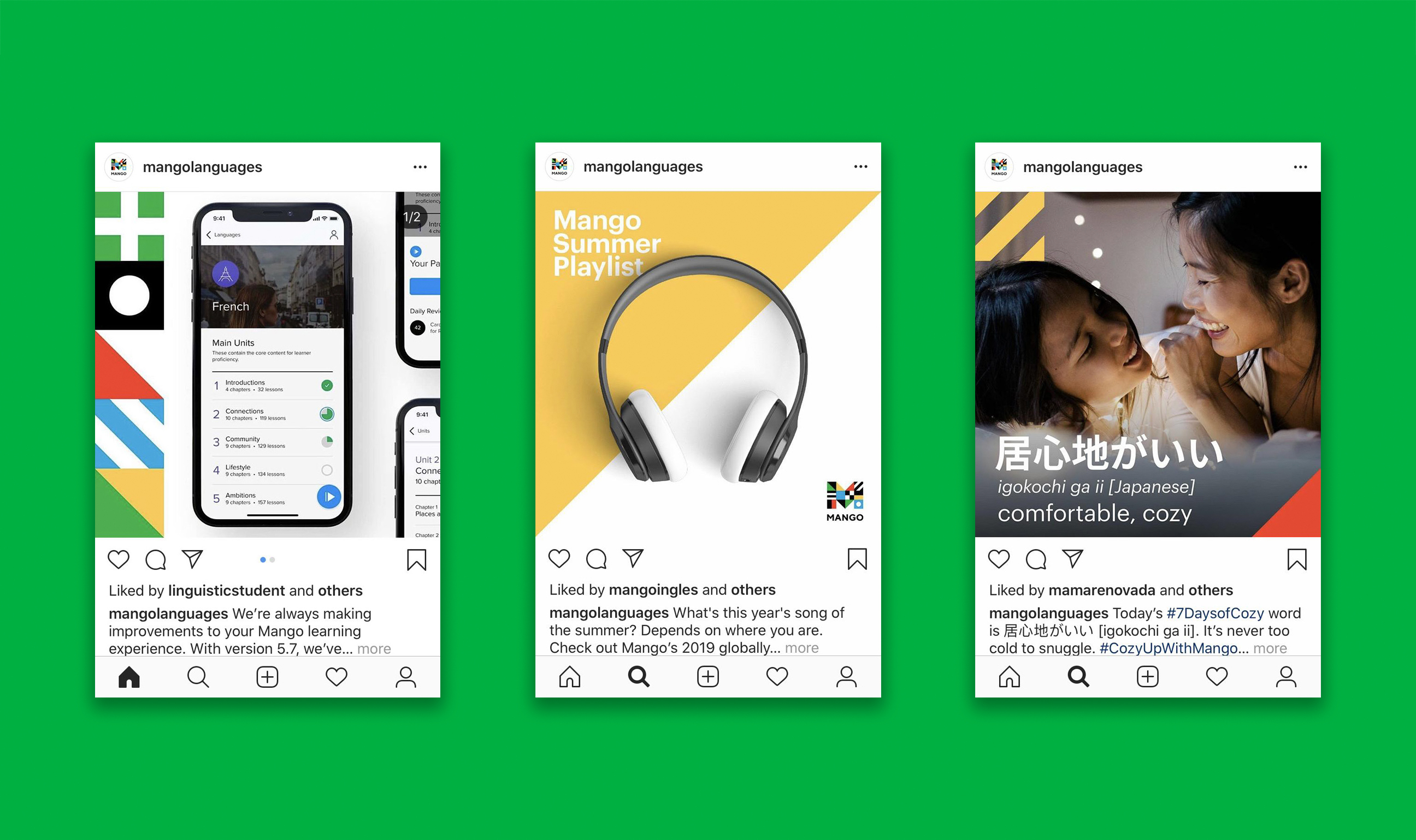
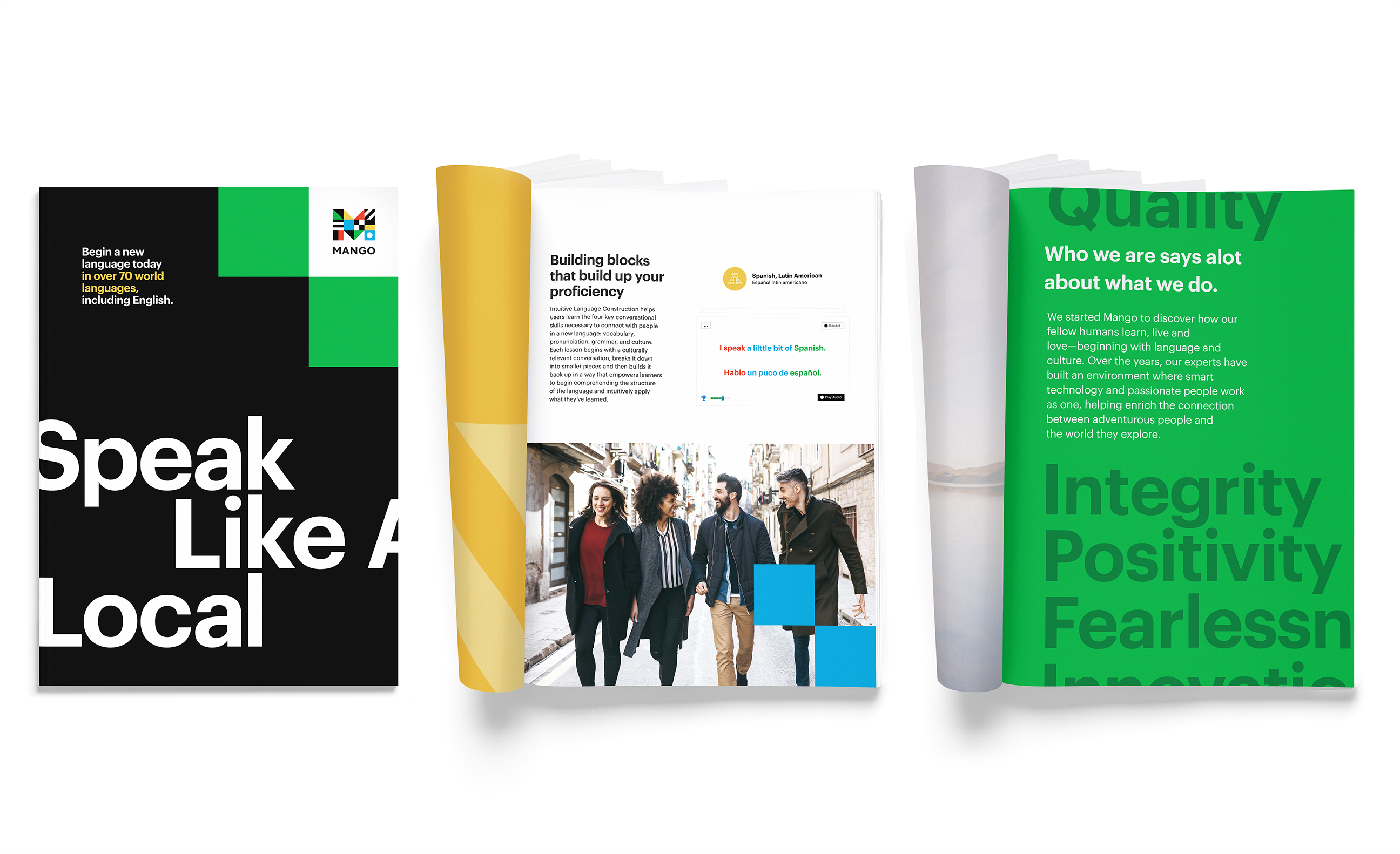
Partnered with Mango to evolve its brand positioning, identity, and expression system, all codified in a comprehensive set of guidelines to support a global launch. We repositioned the brand as a bold gateway to experiencing new cultures, helping it stand out within a crowded language-learning market. The resulting identity draws inspiration from maritime flags, a universal mode of communication that symbolizes Mango’s commitment to helping people understand each other better. Colors commonly found in national flags around the world make up the logo and the brand’s core palette, bringing a sense of global exploration and togetherness. The rebrand marked a clear strategic and cultural shift, celebrating language, travel, exploration, and was recognized with industry awards.





Awards
Muse Awards Winner – Platinum, Brand Identity
Summit International Awards Winner – Gold, Logo Redesign